Revert to Firefox's Add-on Delicious Bookmarks 2.0.64
 I think it's great that the Delicious Bookmarks Firefox Add-on provides an option to switch between normal mode (heavy duty, adds a new menu and syncs your Firefox bookmarks to del.icio.us), and the lean classic mode.
 I'm a big fan of classic mode. I don't want my add-ons in my face. (I do my syncing with Foxmarks, anyway.) For del.icio.us, all I want are the two toolbar buttons, "tag this" and "Delicious." It's fine if add-ins provides more options, but please don't change my user experience if I don't want you to.
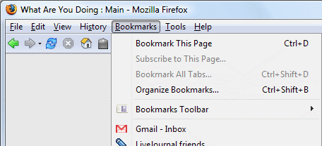
This is how classic mode used to be, and how I remember my Bookmarks menu:
Yay! There's my little "Tag" tool right next to the Home button.
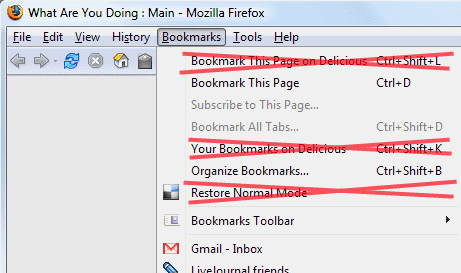
Yahoo decided to "improve" the Classic Mode by adding a handful of menu item to the Bookmarks menu like this:
What were they thinking? Don't they know the whole point of classic mode is not to do stuff like that?
That means I have to drag the mouse considerably further away to access my bookmarks. Those extra menu items were already available on the Navigation toolbar. So the new menu items are simply in the way, and make the menu harder to use. Ugh.
Downloader beware. If you want the clean, uncluttered UI, download version 2.0.64.


Comments