Would You Like To Tweet This?
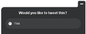
 I just visited a Twitter Statistics page that had a persistent popup window in the bottom right corner that looks like this:
It's got a non-standard shape, ample background space obscuring the page, a close/minimize box, a polite question in a static text field, and a radio control cluster of one choice, "Yes."
So, do I select the "Yes" radio button, then scroll that little window up so I can see an "OK" and "Cancel" button?
I bet all the other websites on the internet feel so foolish for just having "Retweet" buttons.
Why have an simple button with a clear one-word instruction when you can have an overlay obscuring the main page with window controls, static text, and a radio cluster to do the exact same thing?
Comments