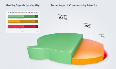
This graphic bothers me way more than it should. If you load the original (http://mediacdn.disqus.com/1325732276/img/marketing/research/infographic_lg.jpg), you'll see that:
1. Comparing against the legend (0 - 50 - 100), you can see that the 61% Positive for Pseudonyms and 51% Positive for Real Identity not only shouldn't both be the same length, but that they're both wrong, sized to 55%.
2. The color choices of red (stop, danger), yellow (caution), and green (go, good) have strong associations with them that don't belong in this graph. They should have used those colors for positive, neutral, and negative feedback instead, maybe.
3. The "Percentage of Comments by Identity" volume chart (or pie chart with vertical slices or bar chart with additional dimensions) is ambiguous. Are we meant to look at volume, horizontal length, or vertical height?
