Backup of David's Livejournal

Dear Lazyweb: Help with Lifestream Design


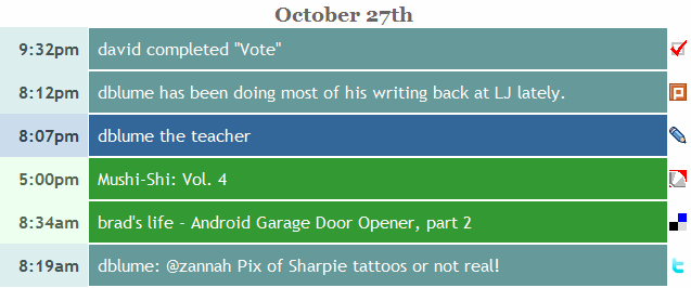
I've got a new feature in my lifestream, but I don't know how to expose it. Currently, the lifestream entries look like this:


I like this look, because it's uncluttered. There are only two noticeable links when you hover over stuff. The text in the middle is a link to the original entry, and the little icon to the right takes you to my account at that site.

However, I decided it would be handy to be able to have lifestream pages that show only entries from livejournal, my family blog, delicious, or plurk, or any of the others.  I made it so.  Yay!  There they are!

But now the problem: From where should I put links to them? It's the same issue as with the lifestream legend. The lifestream legend is meant to be just a little table to help the reader know which services are being tracked. It's a handy thing, but it doesn't belong on the lifestream page. So I left it out.

But it seems like I should be able to put links to the filtered pages somewhere. Hopefully from the lifestream itself, because that's the handiest. But a new link from that page will hurt the current design. Here are some examples that would put the link just to the left of the little icon at the end:

I don't know what I should do.  In the picture above there's a picture of a funnel, which apparently is geek code for "filter."  Below that is an icon of a page with a green "go" arrow (from famfamfam), and below that is a down arrow unicode character.  Below that is a nebulous, mysterious box.  I'm not really pleased with any of these.  I like the feature, but just don't know how to expose it.

Do you have any ideas of what would look good?  Should I leave those links out of the lifestream and put them in from the legend?  Maybe I should change the link of the icon at the end to be to the filtered page instead of my account page at the remote service?
 
[Edit]  Currently, I changed the link of the icon at the end to point to the filtered page.  I'll see how that works.

Comments

 sjonsvenson on Dec 18th 2008 at 10:11 PM
I am a bit dubious about the new feature. Not against it, justt ... check the delicious page. Just put the real delicious page side by side with the lifestream version. It's almost the same. Same thing with the others, the difference between the real and lifestream versions are so sall that it practially makes one superfluous. What would be more interesting (maybe) would be lifestream pages that link on topic. Ex you mention Pocky regulary in Plurk so you might get a lifestream about Pocky. (I think that would involve playing with tags and filters in the different sites ... chalange? )

 sjonsvenson on Dec 18th 2008 at 10:14 PM
oops, the original question ... what about an icon that (somewhat) resembles the USB icon. Something branching from one line into side-branches.

 dblume on Dec 18th 2008 at 11:19 PM
I'm glad you spoke up. A big part of usability on the web is getting things done in fewer hand gestures. I don't think pagination helps users find things. I don't know why the web is so full of it. Looking through the 20 most recent entries, then clicking the next page arrow to look at the next 20 entries, then clicking on the little next page arrow again, just doesn't work for me. Not when you have thousands of entries to look through. It's not just the sites. Lifestreams do it too. Most other lifestreams paginate their data too. It's a pain in the ass to find out what people were doing the Christmas before last. You have to do some sort of painful multiple trip to the server binary search through paginated data to do that. Not with my lifestream. You want to quickly browse it? All of it, on one page? Sure. Here it is. Making people have to do less to accomplish what they want is a big deal. I make people have to click less to get everything. I serve it all up, right away, in very few bytes. Very little chrome. Go ahead, do what you said above. Compare my lifestream delicious page to the one at delicious.com. I've got everything there, on the one page. They've split it up into 20 pages. Twitter? 20 tweets, then pages. Mine? Everything. Lifejournal? 20 posts at a time. Mine? Everything. The lifestream pages are not superfluous. The remote sites allow commenting, browsing my friends, tagging, and deeper navigation. My sites provide a high level view of everything I've done at that site. How long have I been there? When have I been busiest? What have I been interested in at that period of my life? All extremely easy to figure out. If you understand what I'm explaining, you'll see that there's definite value to my pages. There serve a real need of mine, and they've already made themselves useful.

 sjonsvenson on Dec 19th 2008 at 8:54 PM
[i]All of it, on one page?[/i] All the titles. On one very long page (almost a full megabyte). I know what you mean though, and it probably works for you but for me it would be worthless. I have posted four or five times a week on LJ for the last seven or eight years. And with few exceptions I have used the same title : ^_^ Same with my own site, no titles and I start off with the weather every day. To make it useful I would have to show the whole content of each post (much like LJ does). But filing 7+ years on one page would be unwieldy. If a page becomes to long it gets confusing. Actually going from one screenfull of data to another screenfull is often easier by clicking out and going back. When I just have to scroll up and down in the page I easily overshoot the place I want to be at. It's a bit like having a big manual in just one page, I prefer to 'page trough' much like a book. (ps that is one reson why I don't like .PDF manuals).

 dblume on Dec 19th 2008 at 9:27 PM
First: Yep. A megabyte. That's a lot, huh? (Take a peek in your browser's cache, and sort by file size. You might be surprised at how little a megabyte is, nowadays.) Second: Given that you don't fill in titles, we agree, a lifestream that uses titles would be worthless to you. That has nothing to do with this post, though. Third: Yeah, too much data can be unwieldy. I'm experimenting with the display of lots of data. This is one attempt. (More are coming, but it's wrong for me to pre-announce like that.) I'm attempting to let the browser deal with the problem of pagination, instead of round-trips to the server. It's working for my use-cases. I don't ever read my lifestream from top to bottom. I'm almost always doing a "search" for an item of interest, or a sort of scrollbar-dragging-browsing. I get to what I want very, very quickly.

 sjonsvenson on Dec 21st 2008 at 11:11 AM
Just checked my cache, Oh dear, time to clean up again : 1943 files, total 19MB. But only 33 are over 100K and the biggest is 600K. (Notice Opera doesn't cach the HTML on disk and I set the cache size to 20MB so old stuff drops out automatically. ) 1MB isn't impossibly huge I agree ... but my ADSL modem thinks it is (but we often have different opinions ^_^ )

 dblume on Dec 19th 2008 at 10:06 PM
Regarding how useful pagination is, try using it to find out what Kristin was doing online around December 2006, using the pages of her sweetcron lifestream. (Note, you'll have to page around a bit. I didn't link directly to it. How hard is it to find? How can you be sure what year you're viewing?) I suggest that it was harder to navigate to December 2006 in her lifestream (or to just browse around there) than it was in mine.

 sjonsvenson on Dec 21st 2008 at 10:10 AM
Her page took over five minutes to load. Your page took well over tree minutes (though the top was visible sooner) ... Actually confusing, The top opens, I hit ctrl-f and paste "December 2006" in my brower search box. And it returns Could not find the text "December 2006" And then it jumps from the top to the December 31st 2006 line. (ps that's no critique at your page, more a lament about my super fast ADSL line ... )

 dblume on Dec 19th 2008 at 9:58 PM
Regarding the redundant or superfluous claim, it could also be argued that all lifestreams, rss/atom feeds, and feed readers are superfluous, too, because the content is obtained from elsewhere. That's true, but the delivery and the presentation of the content matters a great deal. That's why feeds and feedreaders are here to stay. They're very convenient, once you start using them.

 sjonsvenson on Dec 21st 2008 at 10:41 AM
The redundant claim doesn't apply to the whole lifestream. And redundancy doesn't mean it is wrong. Just when I look a the filtered streams, bundling all the Delicious entries gives you a page that is, apart from the sidebars, alost the same as the actual Delicious page. Same with the Plurk thing, there the layout is different but you see almost the same. The LJ thing is different, the Lifstream lets you navigate the titles, the LJ shows the whole posts. It's more usefull in some cases than others. And the main point I was making is that it would be most usefull with interactive filtering. Ex put a 'search' box at the top, type in "LJ" and you get all the links to LJ. Put in "Christmas" and you get all the links to posts on any site mentioning Christmas. I am not sure whether that is possible, some sites probably block off automatic text-seaching.