This blog's feed URL has changed
I've changed this blog's protocol to HTTPS. If you use a feed reader, please update your feed reader's URL for this site. The new one is mostly the same, but uses HTTPS: https://david.dlma.com/blog/atom/1.
Whenever I have to change a feed URL, I either redirect from the old one, or when I can't, I leave a message like this as the last message on the old feel URL.
I had to do this once before, in 2012. Here's a mention of practicing good feed hygiene back then, too.
Father's Day Challenge

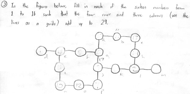
Here's a puzzle my son put in my Father's Day card. He wrote, "In the figure below, fill in each of the sixteen numbers from 1 to 16 such that the four rows and three columns (use the lines as a guide) add up to 29."

You can tell from the pencil markings that I tried to solve it by hand. But it wasn't long before I thought about trying to solve it with a Python script. There's a naïve script that you could write:
for permutation in itertools.permutations(range(1, 17)):
    if rows_and_cols_add_up(permutation):
        print permutation
That one just tries every single ordering of the numbers and then presumably checks things like sum(p[0], p[1], p[2]) == 29 in the testing function. The only problem with that approach is that the potato I'm using for a computer might not finish going through the permutations before the next Father's Day. (No, really. There are over 20 trillion permutations to check.)
Fast but Not Exactly Correct
So I decided to attack it from another angle, just look at the rows first. There are four rows, let's call them rows a, b, c, and d from top to bottom. Row a has a 3-tuple in it, b has a 4-tuple, c has a 4-tuple, and d has a 3-tuple. I wrote an algorithm that first finds all the 3-tuples and 4-tuples that add up to 29.
From those sets of valid 3-tuples and 4 tuples, the algorithm chooses a 3-tuple, a 4-tuple, another 4-tuple, and finally a 3-tuple. It assures that there are no duplicate numbers across any of the tuples. Then if that's true, it checks the three columns, and if they add up to 29, it prints the winning results.
And voilà, it worked, and demonstrated that there are multiple solutions, and found them in mere seconds! I saved that initial implementation as a gist. I thought I was done, but the code was bugging me. I knew that while it reflected the way I approached the problem, it was inefficient (it did too many comparisons), it included duplicate solutions (that's the "wrong" part of it), and it wasn't Pythonic.
Correct but Slower
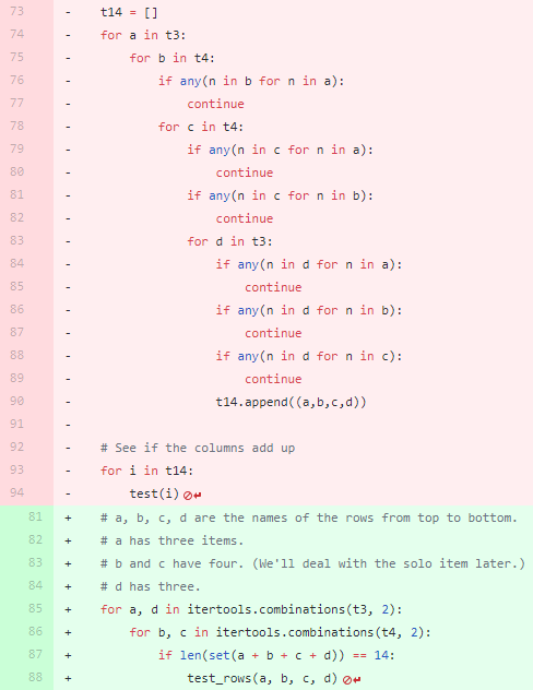
So, a few hours later, I refactored the code, and realized I could replace four nested "for" loops (one for each row) with two loops that each choose two items from their containers (one container of 3-tuples, and one of 4-tuples). And I could check for no-duplicates on one line using a set() instead of explicitly checking for duplicates with "any(this in that)" calls.
The refactor replaced 22 lines of deeply nested code with four lines of simpler code. Not only were there fewer lines, I hoped the program became more efficient because it's iterating fewer times. That's the best kind of change! It's smaller, easier to reason about, and should be faster when executed. It's very satisfying to commit a change like that! The changes to the gist can be seen here:

The red lines are being replaced by the green lines. It's nice to see lots of code being replace by fewer lines of code.
Correct and Fast
I was wrong about it being faster!
Profiling showed that while the change above was more correct because it didn't include duplicate results, it was inefficient because it lacked the earlier pruning between the for loops from the first try. Once I restored an "if" call between the two new for loops, the program became faster than the first run.
for b, c in itertools.combinations(t4, 2):
    if len(set(b + c)) == 8:
        for a, d in itertools.combinations(t3, 2):
            if len(set(a + b + c + d)) == 14:
                test_rows(a, b, c, d)
It's very rewarding to bend your way of thinking to different types of solutions and to be able to verify those results. This feeling is one of the reasons I still code.
Here's the final version of the solution generating code.
Photo by William Doyle / CC BY-ND 2.0
Responsive colors for the Bash shell prompt
Here's a Bash shell tip for changing the prompt's colors to indicate the success or failure of the last command. You can set the background or foreground colors based on an arithmetic expression.
Let's set the background to green for successful commands, and red for the commands that failed. We'll use the commands "true" and "false" as handy example commands.
The trick is that bash's (( )) construct lets you evaluate $?, the exit status of the last command, when it evaluates $PS1.
From Bash tips: Colors and formatting we can see that \e[41m is the control sequence for the red background color and \e[42m is the control sequence for the green background color. So what we need to do is create an expression that evaluates to 42 on success (exit status 0) and 41 for any other value of $?

So the expression we use is: ((!$?+41)).
If $? is 0, then !$? is 1, and ((1+41)) = 42. Otherwise, if $? is anything but 0, then the expression becomes ((0+41)) = 41.
For my PS1, I use the 256-color black background \e[48;5;16m for successful commands, and a deep red \e[48;5;52m for failed commands. So the math becomes a little more complicated:

My expression is ((!!$?*36+16)). Successful commands (exit code 0) make !!$? evaluate to 0, so we get ((0*36+16)) = 16. Otherwise, it becomes ((1*36+16)) = 52.
Using a little math you can customize your bash prompt in various ways to indicate the success or failure of the last command!
Edit: The only constant is change
The truth is, I've since changed my prompt. Here's what it looks like nowadays:
I don't just use bash's arithmetic construct anymore, I use an "if" expression in the prompt to decide to print the checkmark or the cross-out character. I think this is more pleasing then the change in background color. It sort of corresponds to the following:
PS1='$(if [ $? -eq 0 ]; then \
   echo -e "\[\e[32m\]\xe2\x9c\x93"; \
else \
   echo -e "\[\e[31m\]\xe2\x9c\x97"; \
fi) \[\e[38;5;242m\]\w$\[\e[0m\] '
Into the Next Dimension
![]() A few years ago, I created an 8-bit pixel-art version of my avatar that had a predominately blue sky and a small version of myself offset a little towards the right.
A few years ago, I created an 8-bit pixel-art version of my avatar that had a predominately blue sky and a small version of myself offset a little towards the right.
The new avatar lasted for a few years. However, I grew older, grayer, and balder and my avatar didn't.
I wanted to update the avatar, but I didn't want to "cheat" the rules of my pixel art. Any changes I made had to be made while retaining the 16x16 pixel dimensions of the icon.
I updated the pixel-art image to make the hair thinner (more semi-transparent at the top), and grayer on the sides above the ears, and I moved the part in my hair to the correct side.
And then Trump got elected to be America's next President, and everybody seemed to be more divided than ever.
![]() I wanted to add a suggestion to my avatar that I care about what's happening in America and how it affects everybody. I considered being political, but didn't want to further the divide between the right and left amongst my friends. Eventually I settled on the idea that my avatar should be shown to be thinking about everyone on the planet, not just one particular challenge. So I made room for a thought-bubble indicating that I was thinking of the Earth as a whole.
I wanted to add a suggestion to my avatar that I care about what's happening in America and how it affects everybody. I considered being political, but didn't want to further the divide between the right and left amongst my friends. Eventually I settled on the idea that my avatar should be shown to be thinking about everyone on the planet, not just one particular challenge. So I made room for a thought-bubble indicating that I was thinking of the Earth as a whole.
That's my attempt (above) at a 4x4 pixel-art earth in the thought bubble. Hope it worked!
![]() Eventually, I started seeing charming voxel artwork being done with magicavoxel. This seemed like an opportunity to see if I could translate my 2D avatar into 3D. Challenge accepted!
Eventually, I started seeing charming voxel artwork being done with magicavoxel. This seemed like an opportunity to see if I could translate my 2D avatar into 3D. Challenge accepted!
So here's my latest avatar: A 3D 8-bit voxel version of myself thinking about the world. I kept it as faithful as possible to the 2D pixel art version. Nowadays, I have to wear glasses to read, so one version of my avatar wears glasses, and another doesn't.
I think I can live with this for a while. Let's see how it goes!
Did you notice the cheats? The nose isn't aligned on voxel boundaries. The eyes are two voxels apart, so the nose is one voxel wide but positioned a half-voxel from each eye. It's also only half a voxel deep, but that's really hard to tell. And of course, the glasses are at 1/8 voxel scale. But for some reason, I allowed myself these cheats in the voxel version.
My TechCrunch Feed Filter
It's the the sixth anniversary1 of my TechCrunch Feed Filter. In Internet time, that's ages. A lot has changed. Here's a look back.
The Problem
TechCrunch was a great blog about innovation and entrepreneurship. As it grew, it published more articles than I cared to read. Like many savvy blog readers, I used a feed reader to present the latest articles to me, but TechCrunch was simply too profuse.
The Solution
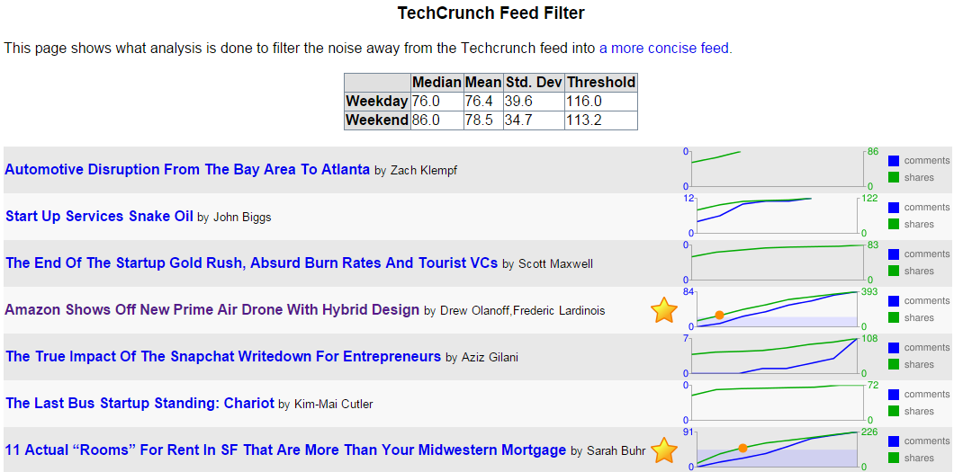
I created a service that'd visit TechCrunch's feed, and make note of who made which articles, what the articles were about, how many comments each article had, and how many Diggs2, Facebook likes and Facebook shares each article had.
With that data, the service would determine the median, mean, standard deviation, and create a minimum threshold for whether the article merited being seen by me. The raw data is stored in a live yaml file. There were some special rules, like, "If the article is by Michael Arrington, or has "google" in the tags field, automatically show it to me." Otherwise, other readers had to essentially vote the article high enough for it to pass the filter.

In the picture above, you can see that two posts out of seven met the criteria to be in the filtered feed. They're the ones with the gold stars. The threshold was calculated to be 116 shares, and you can see in the graph when each article had more than the threshold. (There's a red circle at the point the green shares line rose above the blue area that designates the criteria level.)
Once the service knew which posts were worthy of my attention, it listed them in its own filtered feed.
Changes over Time
In the beginning, TechCrunch used WordPress's commenting system. As such, its feed included the slash:comments tag. At the time, that was the best metric of how popular a TechCrunch post was, better than Facebook shares. But TechCrunch started experimenting with different commenting systems like Disqus and Facebook comments to combat comment spam. Neither of those systems used a standard mechanism to get comment counts, so every time it changed commenting systems, I had to change my service.
Digg, whose Diggs were once a great metric of the worthiness of a TechCrunch blog post, faded away. So I had to stop using Diggs.
So that left Facebook's metrics. They weren't ideal for assessing TechCrunch articles, but they were all that was left. Using Facebook likes and shared worked for a while. And then Facebook changed their APIs! They once had an API, FQL, that let you easily determine how many likes and shares an article had. The killed that API, leaving me with a slightly more complicated way to query the metrics I need for the service to do its work.
Not The End
I've had to continuously groom and maintain the feed filter over these past six years as websites rise, fade, and change their engines. And I'll have to keep doing so, for as long as I want my Feed Filter to work. But I don't mind. It's a labor of love, and it saves me time in the long run.
1 One of the original announcement posts.
2 Remember Digg? No? Young'un. I still use their Digg Reader.

 Entries